Think about the last time you bought something. Was it an item you needed, or were you drawn to purchase it because of the interesting packaging? For example, the last time you bought body wash: did you need that brand you chose, or was it because of the expensive-looking bottle? Did the shape of the packaging make you feel fancy?
This is the whole point of packaging. When done properly, the packaging is what will sell your product. It will attract attention and make consumers feel a particular way. Here are some ways to make your product stand out among all the others.
1. Patterns
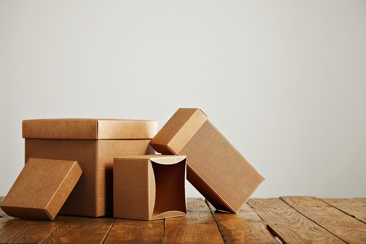
If your packaging is plain and simple, think about using patterns to step it up. You don’t need an elaborate pattern; simple stripes or dots can make a package feel elegant, playful, youthful, patriotic, or relaxing.
2. Simple vs Elaborate
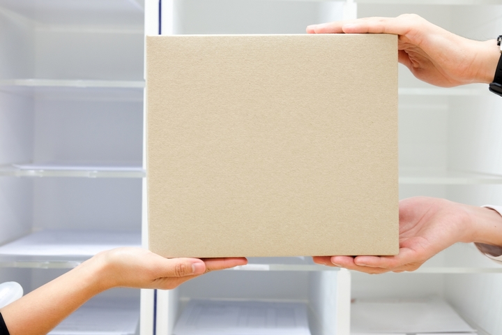
Not all packaging needs to be elaborate; sometimes simplicity is the answer.
3. Consider All the Space
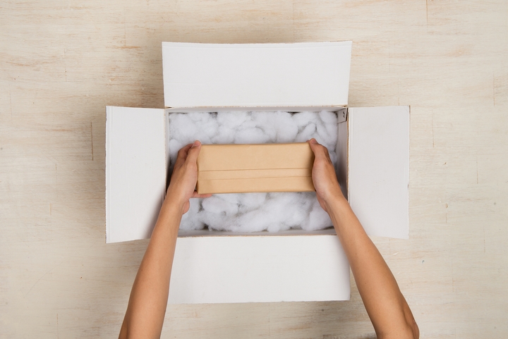
When you create a package, use every single inch. Think about a box within a sleeve: if you leave the inside of the box plain and untouched, it might feel unfinished. If you instead use a floral pattern on the interior, it will make the box, and thus the product, feel more upscale.
4. The Experience

Think of all the steps a person will go through while opening the product. Imagine a pair of luxury slippers. Would you just toss them in a paper bag to sell? No, you want to sell the person the whole experience. Imagine the slippers inside a silky dust ruffle which is placed inside the box. When the person opens the box, they see the silky drawstring bag nestled lovingly inside. Then they will discover the slippers inside, which adds to the luxury aspect.
5. Be Playful

If your product will work with a playful packaging, go for it! Just keep it simple. Take a pint of raspberries, for example. A cartoonish illustration of a monster opening its mouth to eat a berry, placed on top of the clear packaging, will allow the product to show through and interact with the illustration. Use a playful font to add even more punch.
6. Complement What’s Inside
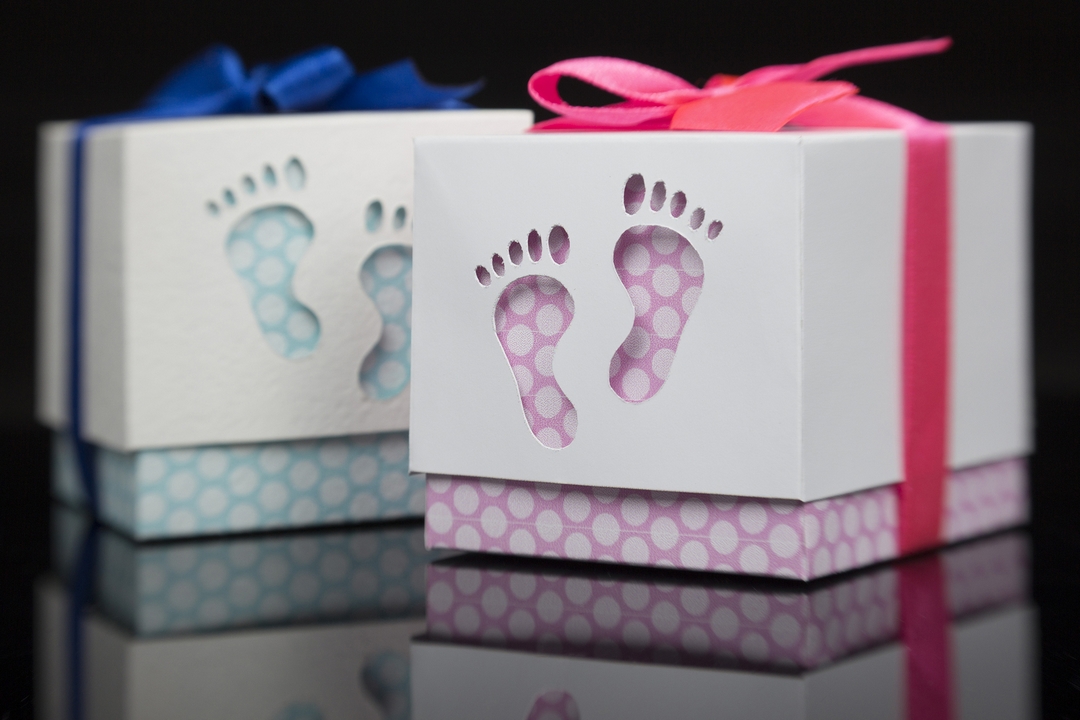
Ensure your packaging design goes along with the product it holds. Say, for example, you are packaging some dried loose tea. Keep your packaging simple and natural, like your product. Consider keeping part of the package clear, so consumers can see that you’re proud of what you’re selling, and can see what they are buying.
7. Be Bold

When you use different shapes and colours in an interesting pattern it will help your product to stand out from others on the shelf. Consider a bottle of tequila in a bottle that has a stained-glass-looking design on it, in bright and fun colours and shapes. The package is fun and playful, and promises buyers a good time.
8. Don’t Limit Yourself

If your item is best being packaged in a certain type, don’t limit your thinking to the basic idea. Soap, for example, comes best in a box, but instead of a regular box sleeve, have the box fold open. This presents to the buyer as being special and interesting. The consumer could also keep the box to use for decorative storage.
9. Be Modern

Sleek, simple, and modern designs stand out. Clean lines, sans serif fonts, and simple colours help achieve a modern look for your packages.
